 |
| 1st Project in Prepress Production I -The Dung Beetle- |
Yes, finally, without further delay, some artwork that I had submitted for homework at the College.
Now, I have to say that I am very dissapointed in myself not only for taking so long to post these photos, but in the final versions of the work submitted. I am always finding something else to tweak, to fill in, to straighten.
 |
2nd Project for Prepress I A Reproduction of a Design given to us by our prof (my first 10/10 by the way!) |
I have been complaining that I haven't had time to post because of these projects, and it's true, but it is certainly because I am not being as efficient as I would like to be from day to day. This means that I have to manage my time differently. Change my routine.
This begs the question:
Can you teach an old dog new tricks?
Can you teach an old dog new tricks?
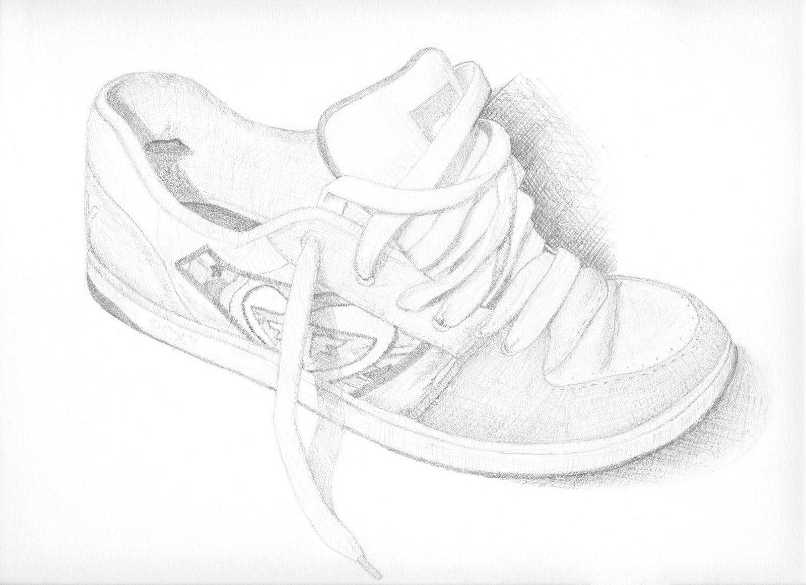 |
| Illustration I Shoe |
Don't get me wrong, I am posting these pictures because I am proud of my work, no matter how small. But in each case I would have liked more time for some final adjustments. In fact, I would have liked an extra 3 hours with most of them, particularly my latest Prepress projects. I am afraid to see the grades of the most recent hand ins, especially since I was cringing while handing them over.
 |
| Design and Layout I Tattoo Project A |
 |
| Design and Layout I Tattoo Project B |
One final word on the Tattoos above, which I am both happy and anxious about. I had really enjoyed this project, but the limitations were slightly difficult for me. The parameters of the project were to design a tattoo 12-16 square inches that I would personally get inked, and to show the same elements in symmetrical and asymmetrical layouts. First of all, as many of you know, I would prefer something larger, but the project also demanded that the tattoo incorporate script of some sort, which I had never thought I wanted.
I sought some advice from my cousin who reminded me that the best tattoos, those that stand the test of time, are often very simple. After much debating and more than 20 thumbnails of different ideas, I decided on something simple yet significant for this period in my life...
I have recently just moved back to the rose city; I enjoy the simplistic nature of old school roses like this; and I am at a new point of growth in my life where I can only hope to Blossom in all kinds of ways. Many other elements of this design speak to me right now, and, despite my previous reservations, this is a tattoo that I would actually get (that's right Rob Brown, mark me down for an afternoon appointment).
Since having this returned to me, I have thought hard about the script, and have decided that any lettering would have to be French, in honour of my heritage and to serve as a reminder that I love this language, and that I need to practice it as often as I can.
I have since sketched another rose, where the script runs across the rose like a signature, but also blends into its petals, like it is all combined in a circle that never ends. I hope to find some time to work on this between projects and to post it soon. Rob, I'll keep you posted.
In the meantime:
Fleurit.
You get better at drawing everytime I see your work.
ReplyDeleteThanx, K8. Come check out the new stuff
ReplyDelete